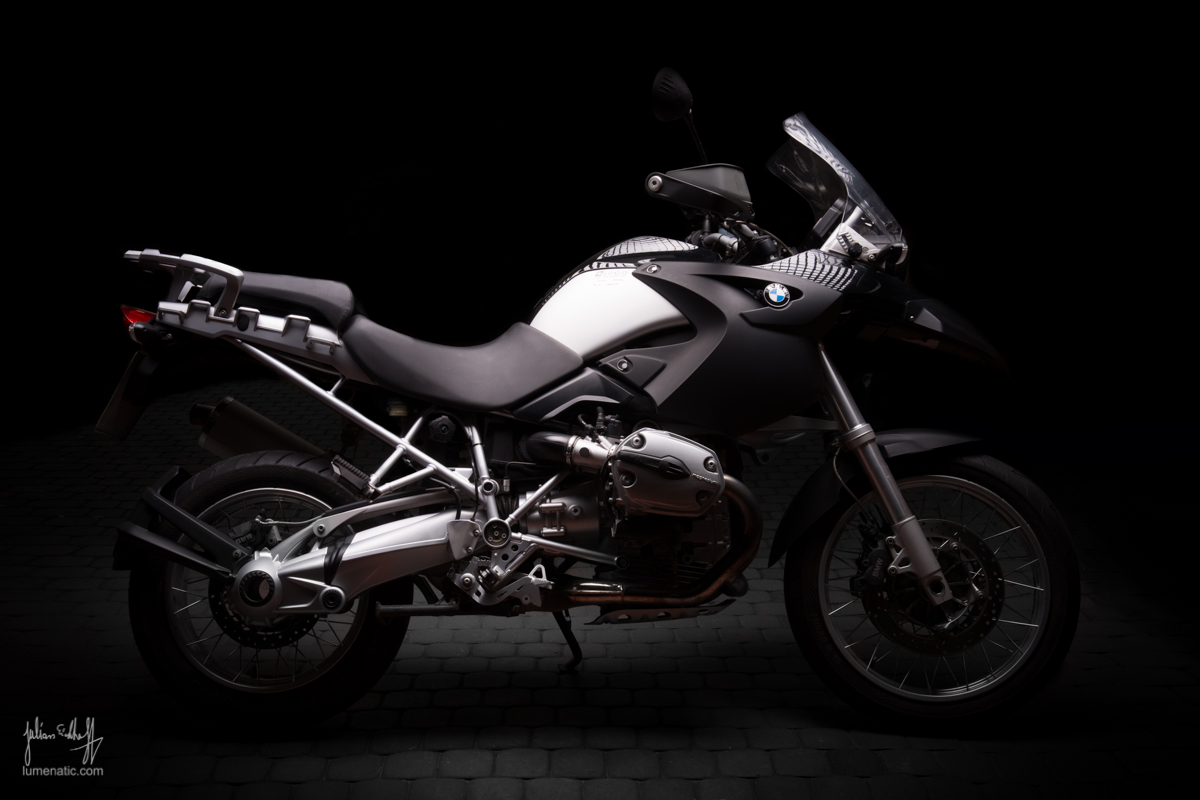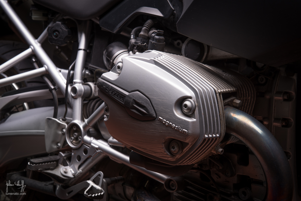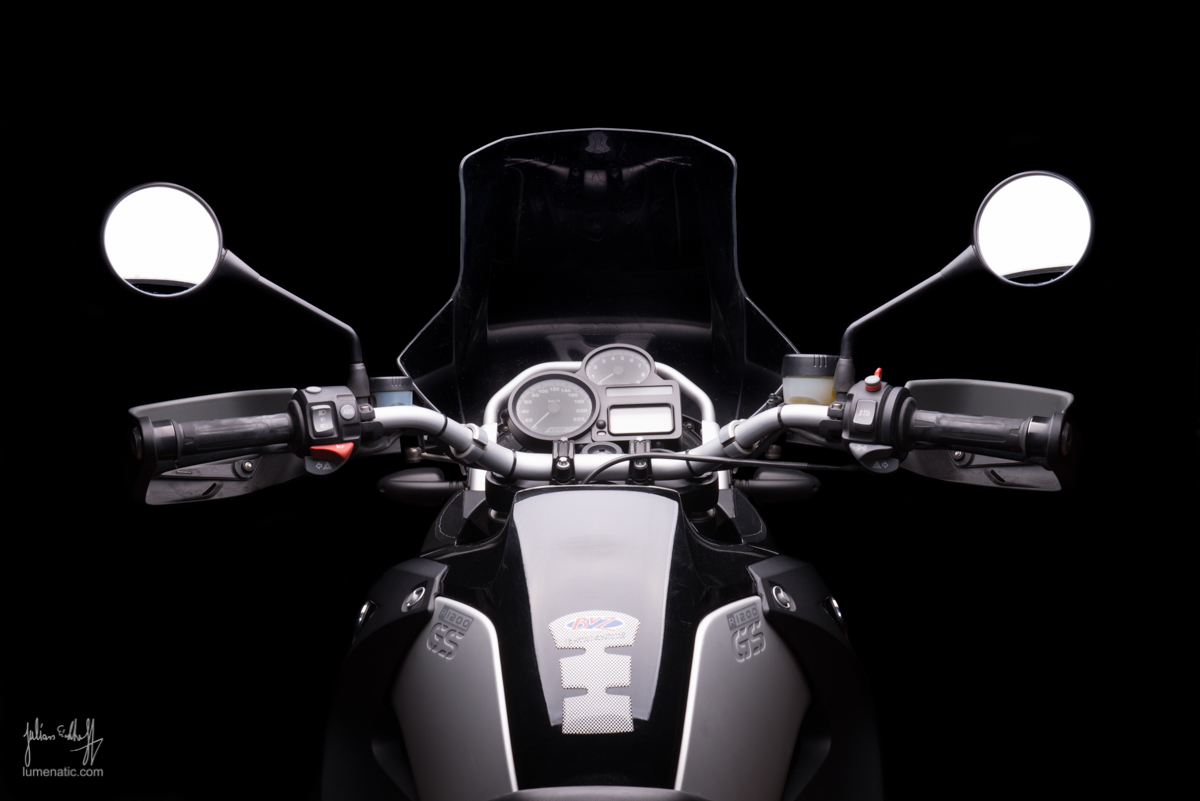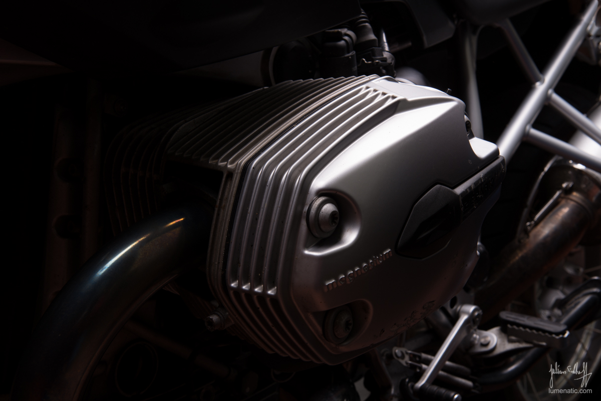
My photographic year has been dominated by motorbike shoots and I intend to keep it that way. Because it’s big fun and the results are very satisfying.
In my last studio session I photographed my Yamaha and my friend’s Moto Morini (the faithful reader of this blog will recognize the bikes by now). I wanted to repeat the studio session and asked two other bikers if they were willing to get decent shots of their rides. And guess what – they were willing to do so.
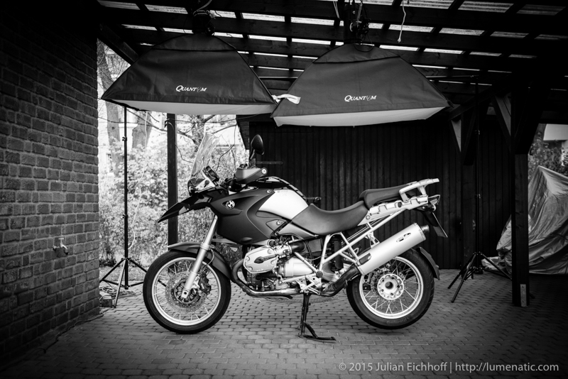
So, on the following week-end, I set up the studio setting in our carport again.
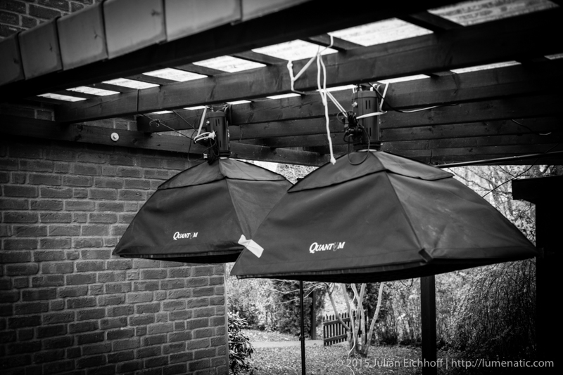
I strapped the Quantuum studio flashes to the wooden framework of the carport. As you can see in the first image, the right softbox hangs a little lower due to the tilted roof of the carport. I pondered hanging the left softbox at the same height, but as you can see in the third image, the BMW is a tall fellow, so theleft softbox must hang a little higher. Actually I found this setup quite appealing, because the overlap of the two softboxes minimizes the gap between the two light fields.
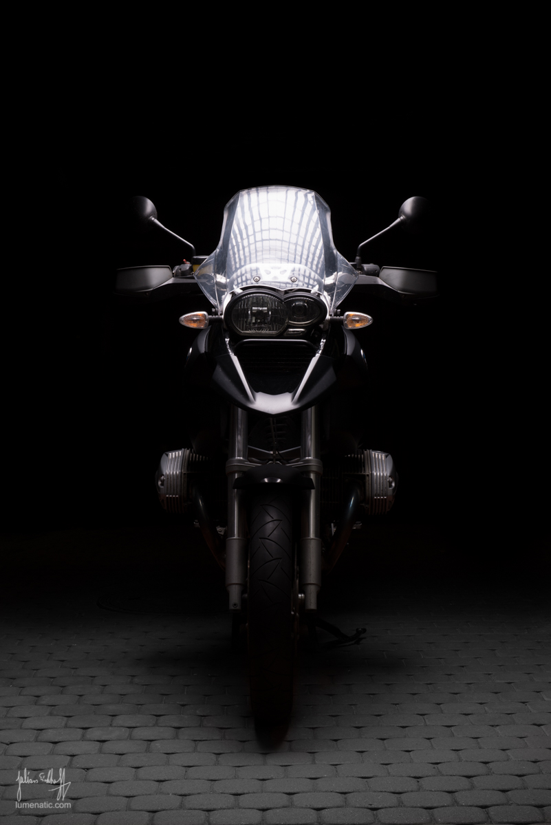
 When I started taking pictures of the BMW I checked the LCD screen of my camera and was quite pleased. “Hey, everything in the background looks so dark, no need to set up the black background cloth !” It was very windy that day, so the background system would have been blown over instantly. And since the pictures seemed ok on the LCD screen, I opted to continue shooting like that.
 Long story short – Back on the computer the background did not appear as black as I thought it would be – everything was visible. Not very clearly, but still visible. This is where a wonderful journey in Lightroom and Photoshop began and I had to retouch everything in the background.
I learned to hate spoke wheels. You have to darken everything between the spokes and boy, did I curse. I spent 1,5h alone on retouching the gaps between the spokes. But it was worth it at the end.
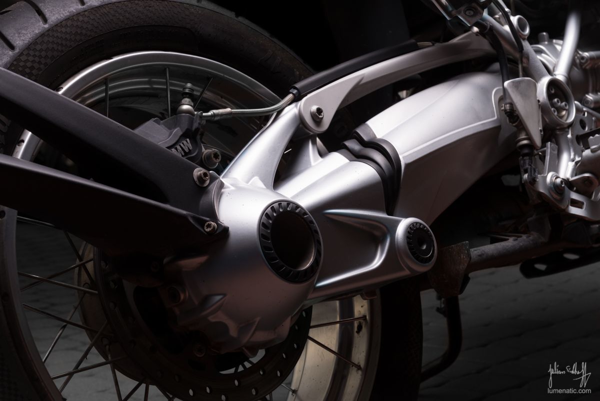
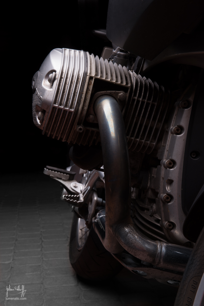
As you can see on the following image I used a grid on the softboxes to guide the light. Since motorbikes and cars are giant mirrors, the lightsource and its shape will show in the glossy parts. That is why you see the grid in the reflections. It’s a matter of taste – not everybody likes it, I found it to be a refreshing alternative.
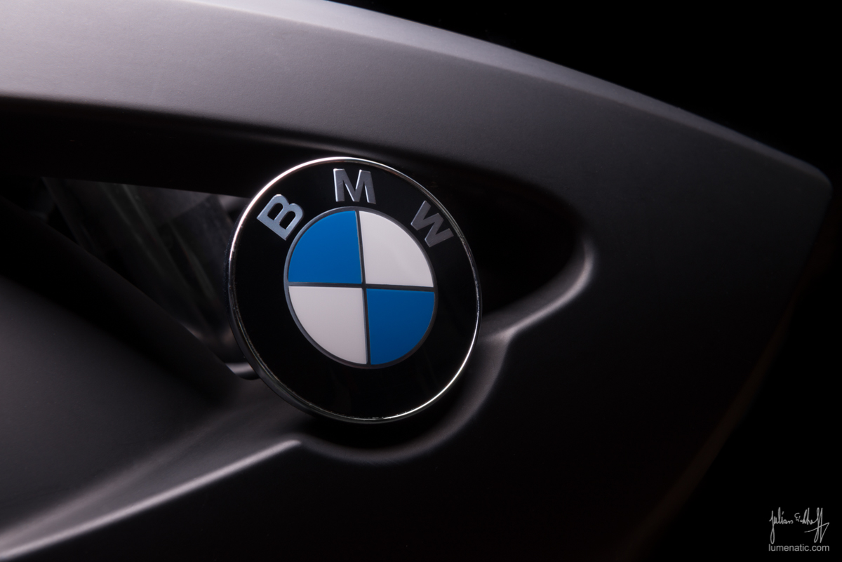
A last tip, which will save tons of time. Clean your bike properly ! What you won’t recognize from a metre away in real life will be seen on an image. I don’t know what it is, but dirt and other blemishes are seen on images immediately while being overlooked in real life. I spent quite a while stamping away dust on the logo closeup and other small things on other pictures.
Either you bring a spotless bike to the shoot or a _really_ dirty one, and I am talking layers-of-mud-dirty (would also make cool shots).
Lessons learned:
- If you have a backdrop system, use it. It will save you a lot of time in post
- Mount the bike on the center stand or a rear stand, if the bike does not have a center stand. The bike won’t be distorted that way and look better.
- Clean your bike if you want spotless images. Remember: Either it is _really_ dirty or it is spotless. Anything in between transports the ugly truth: “I was too lazy to clean it properly !”

