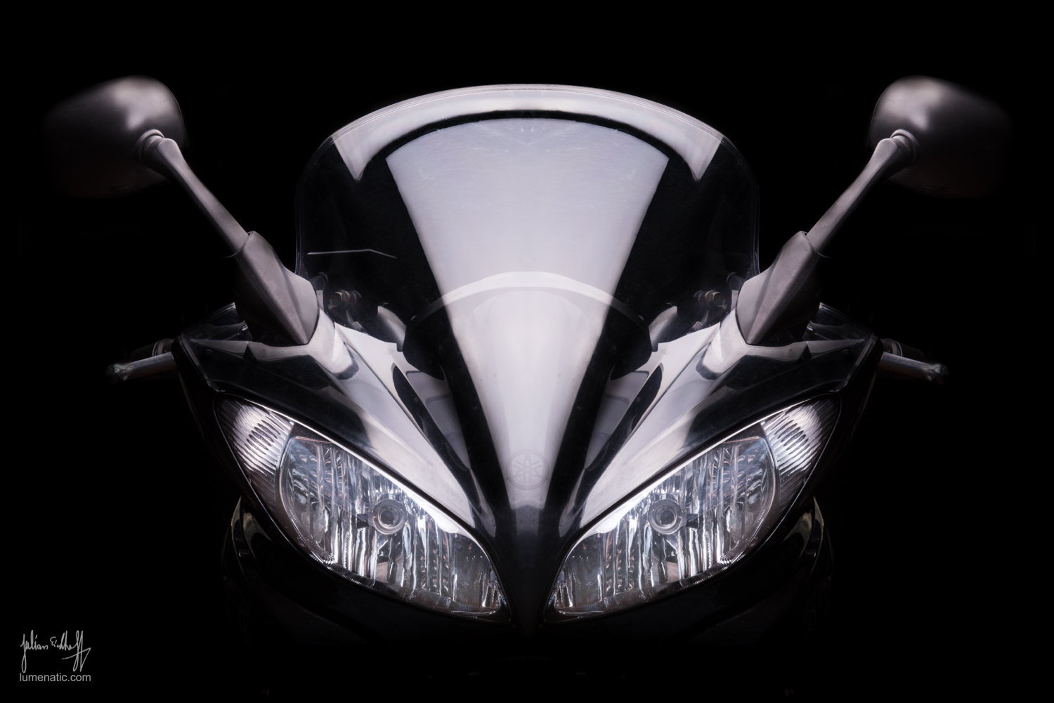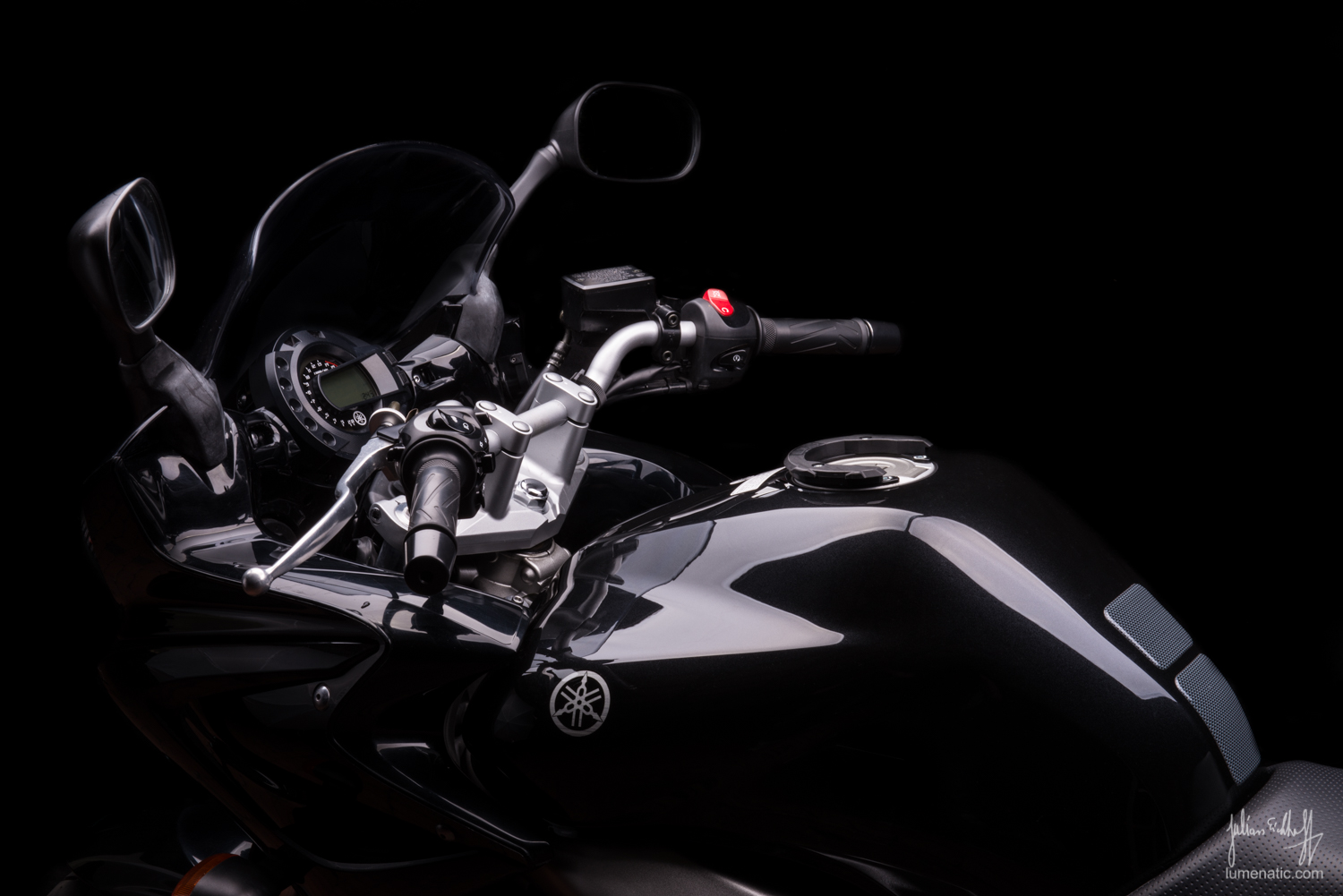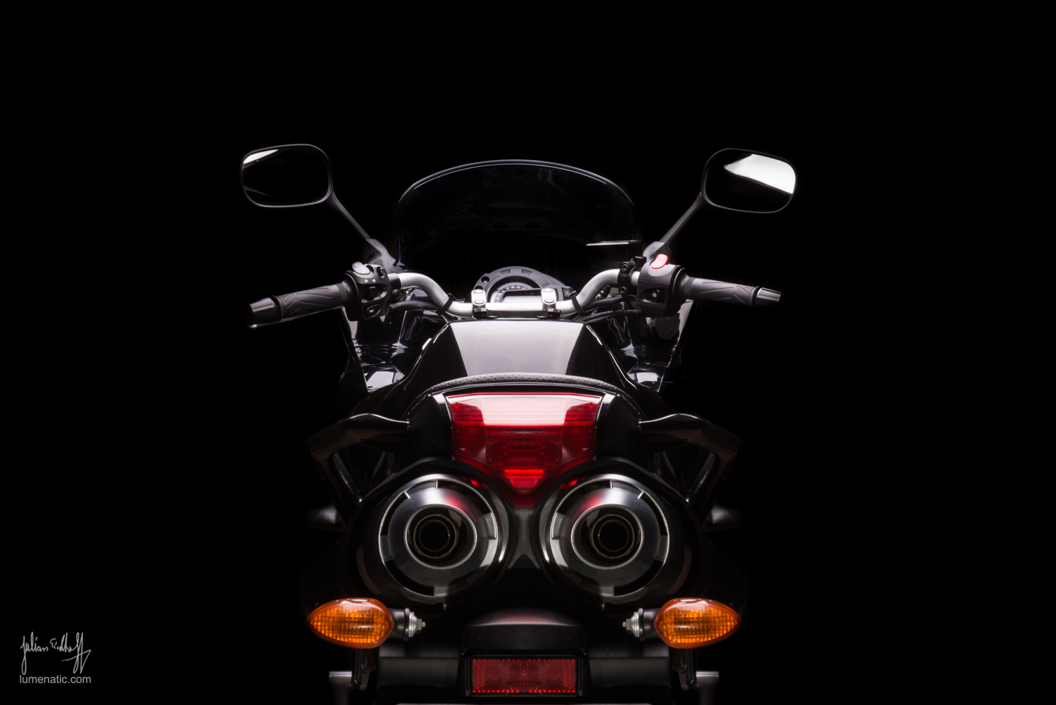
I have photographed motorbikes excessively this year (Link1, Link2, Link3). All these shootings took place in the bike’s natural habitat: roads, streets and in one case an open field. These shootings are fairly easy concerning the logistical part – just take the bike somewhere at the right time of the day, bring a camera, maybe a tripod and flashguns, and off you go. But I wanted to knock it up a notch and go into a studio environment. Last year I conducted several photo sessions with sports cars in the studio… ok, _model_ sports cars (Ferrari FF, Lamborghini Aventador) and I particularly like the shots with light straight from above, illuminating the silhouette and some details on the cars. I had to use model sports cars because a.) I don’t own a Ferrari and b.) neither do I own a lighting rig large enough to illuminate the whole car (like this one). But I own two 80×120 cm softboxes with studio flashes – and that is big enough for a decent bike shoot.
Setup
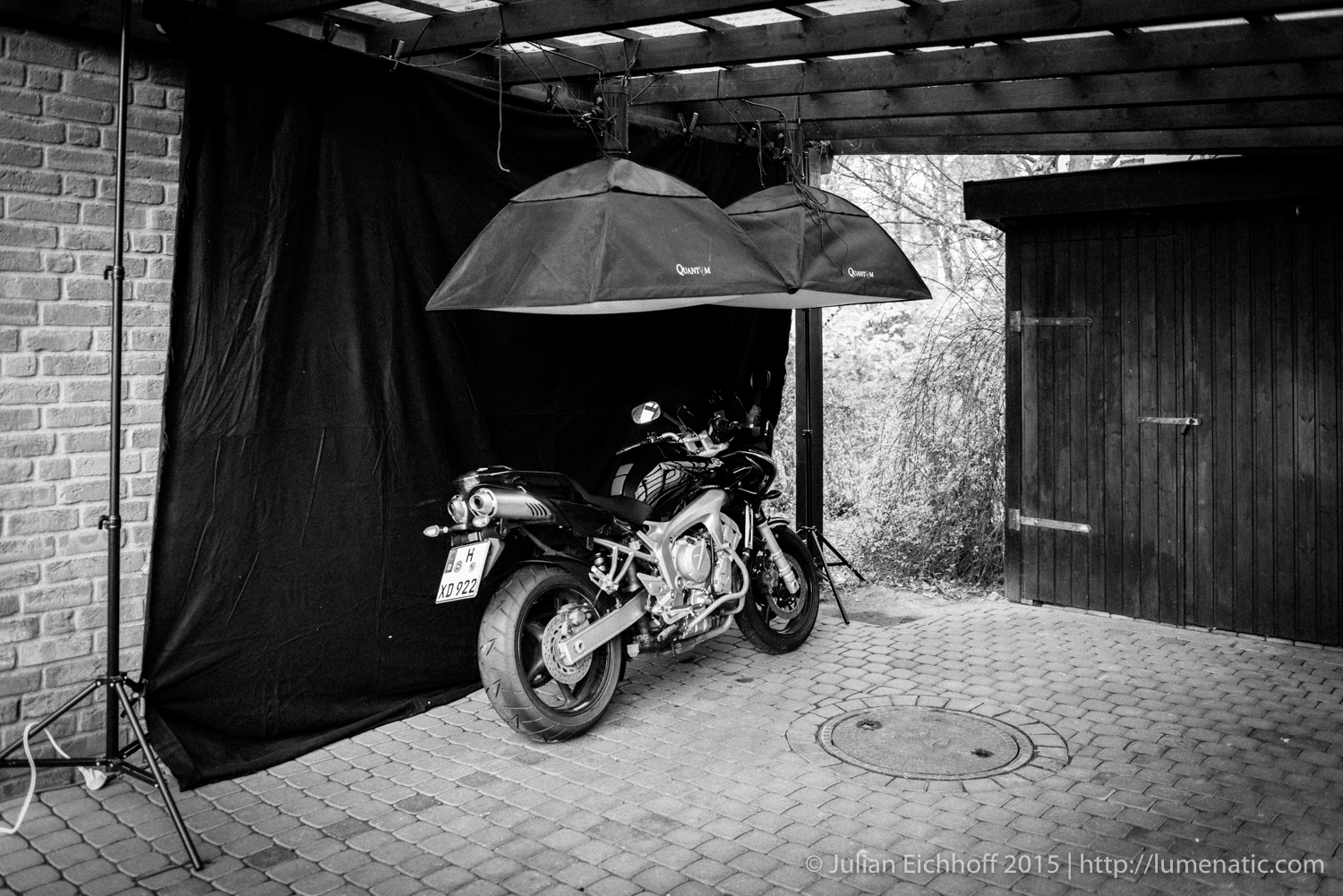
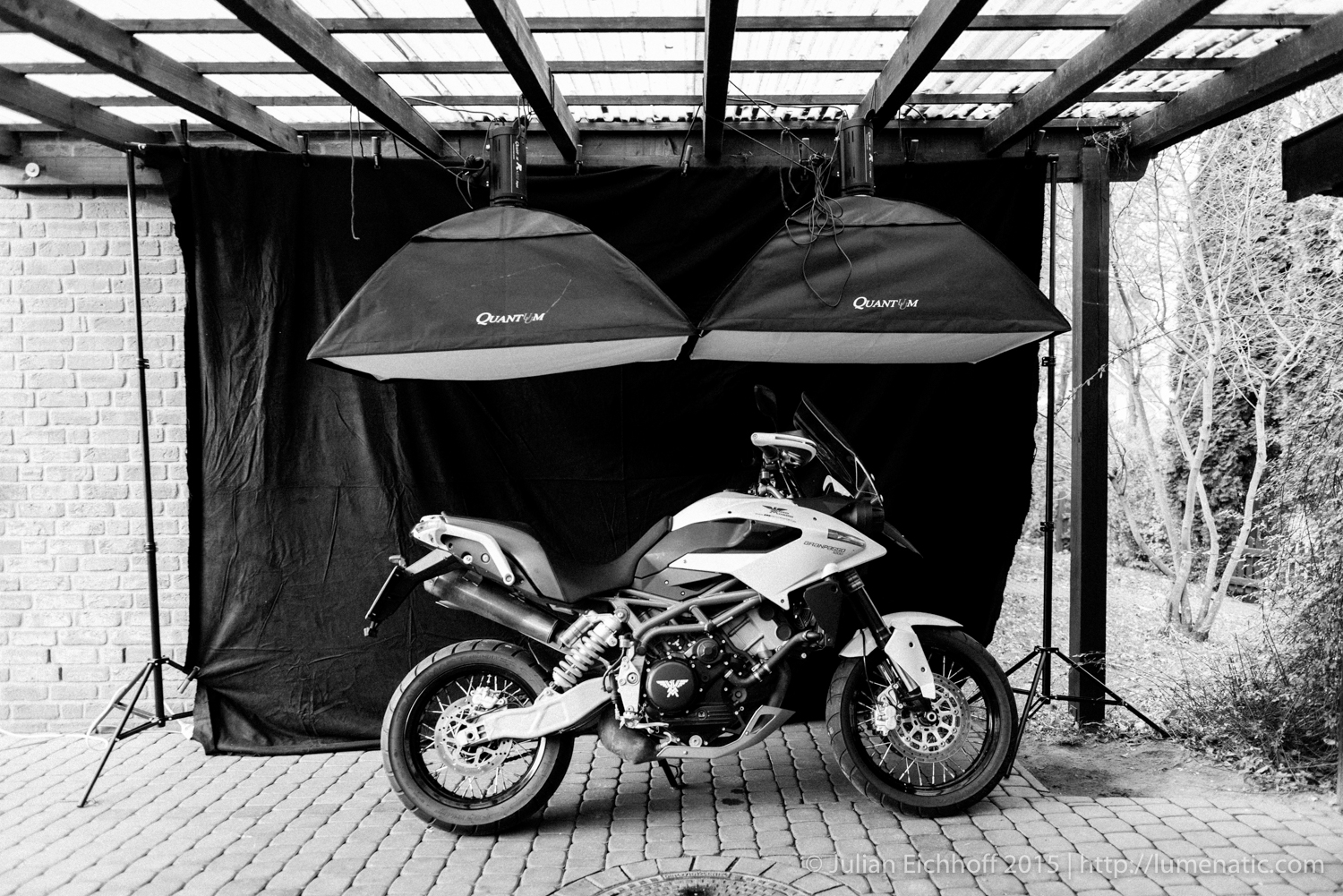
I cleared the carport in front of your house of the trash can, bicycle and our car, sweeped the floor and started installing my equipment. I hung both softboxes from the beams of the carport roof and installed the background system with black cloth behind it as a backdrop. The studio flashes were tied to the beams using thin rope. The edges of the softboxes which are in contact with each other could be velcroed together, so that the gap between the softboxes is as small as possible. The lighting setup is not complex in terms of fancy technology – suspend a large softbox (or two) above the subject and place a dark background behind it. But due to the dimensions it took some effort. The setup took around an hour to be completed.
Equipment used:
- Two Quantuum R600+ studio flashes (600Ws) with 120×80 softboxes, fired via Yongnuo radio triggers.
- Background system with black cloth
- Nikon D800 with the 24-70 f2.8 (the 70-200mm) would have been my first choice, but I did not have enough room to back away from the bike).
The flashes were set to full power, the camera to ISO 100 and a varying 50-70 mm at mostly f/22. Looking back I could have gone with f/16 and less flash power, that would have given some more sharpness in the images. But since most details will lie in the dark in these images I deem the choice of the f-stop to be ok.
Tips and experiences shooting with this setup
Bikes often only have a side stand, which means that they will lean to one side when the side stand is extended. Depending on from which side you are shooting, there will be more or less light on the side of the bike. Assuming the side stand is on the left the bike will lean towards you when it faces left. Since the light is coming from above the side of the bike will be quite dark in this position. On the other hand, if the bike faces to the right it will lean away from you, exposing the side to more light.
I found out that if the bike leans towards you, the shot tends to look…odd/stupid. Due to the perspective the bike is crunched a little and appears smaller. That looked odd on many shots. Here it is an advantage if your bike has a main stand to position it vertically.
Since the setup takes some effort it is advisable to take as many shots as possible. Move back and forth, photograph the bike as a whole, move in for detail shots, turn the bike around, take shots from unsual angles. Look out for nice details.
If you feel so, use a third, handheld flash as a fill light from the side. I experimented with it a little, but found that the fill light intervenes with my idea for minimalistic lighting. But maybe you have other ideas.
Post-processing
 The raw images were far from perfect. The light cone emitted by the softboxes hit not only the bike, but also its surroundings, see left. So there was much work to do. In Lightroom I used the brush tool to bring the surrounding area of the bike down to black. Using a brush with a soft edge I painted around the bike, brutally drawing down eyposure, lights and shadows.
After approx. 1/2 of the surrounding area had been painted serious lag began to build up. The mask Lightroom is creating becomes too complex and the software is struggling to keep up with the changes. After 2/3 of the editing process the lag is next to impossible to work with. Five seconds between a brush stroke and seeing the effect on the screen is not an exxageration. I work on a late 2012 iMac with 304 GHz Intel Core i7 processor and 24 GB of RAM. It can’t be a lack of computing power. Lightroom is simply bad coded, the program does not use the computer’s full capacity. But that’s another chapter.
Photoshop is the far better choice when you make vast edits to the image. I edited a few images with Photoshop and there was absolutely no lag (working with dodge/burn via layers). So that’s another lesson learned. The drawback: The Photoshop file of your image suddenly is 480 MB large. But hey, whatever you do, there is always a catch. Being able to work lag-free is far more valuable than disk space.
Things I would have done differently, if I were able to do of have thought of it:
- Shooting on a concrete floor: Our yard is paved with red stones, can not change that. A concrete or asphalt floor would have been better, because it would emulate a workshop enviroment.
- Honeycomb grid for more direct light: these would bundle the light a little and minimize light spill to the sides. Would accentuate the lighting and reduce the post processing (unwanted lighting of the area around the bike).
- Increase the distance between the background and bike/flashes: Since the background was close to the bike (spatial restriction in our yard) the black cloth was heavily lit by the flashes. That meant a lot of work in post-processing (making the background disappear in black)
Bottom line
A work-intensive shoot, both in preparation and post processing. But the results are deeply satisfying, I am totally excited about these catalogue-style shots. If I get the opportunity to photograph another bike I would be happy to use this setup again.

